Brief and research
A short brief on your business, audience and competitors. We look at what the category already looks like so your mark stands apart instead of blending in.
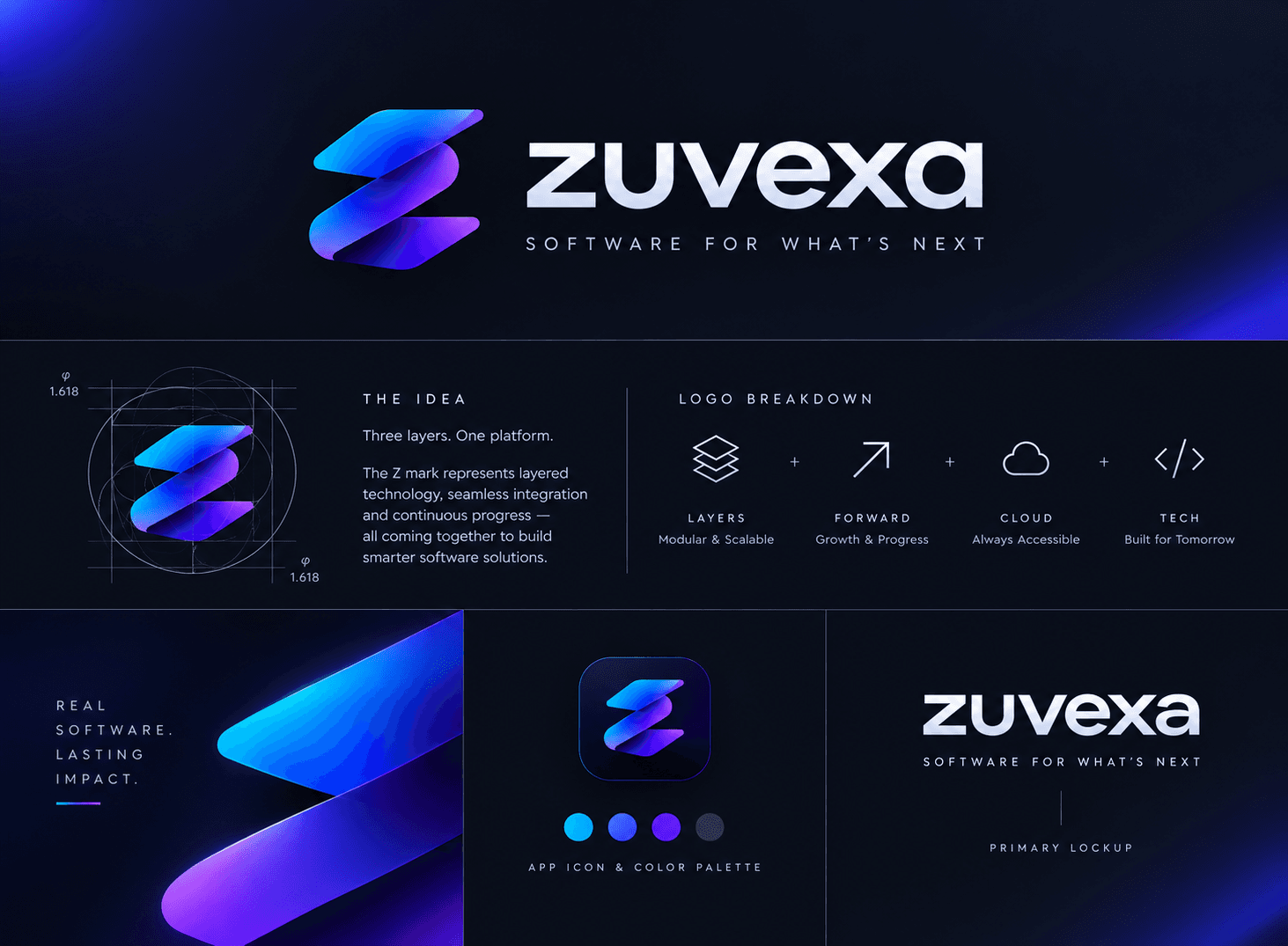
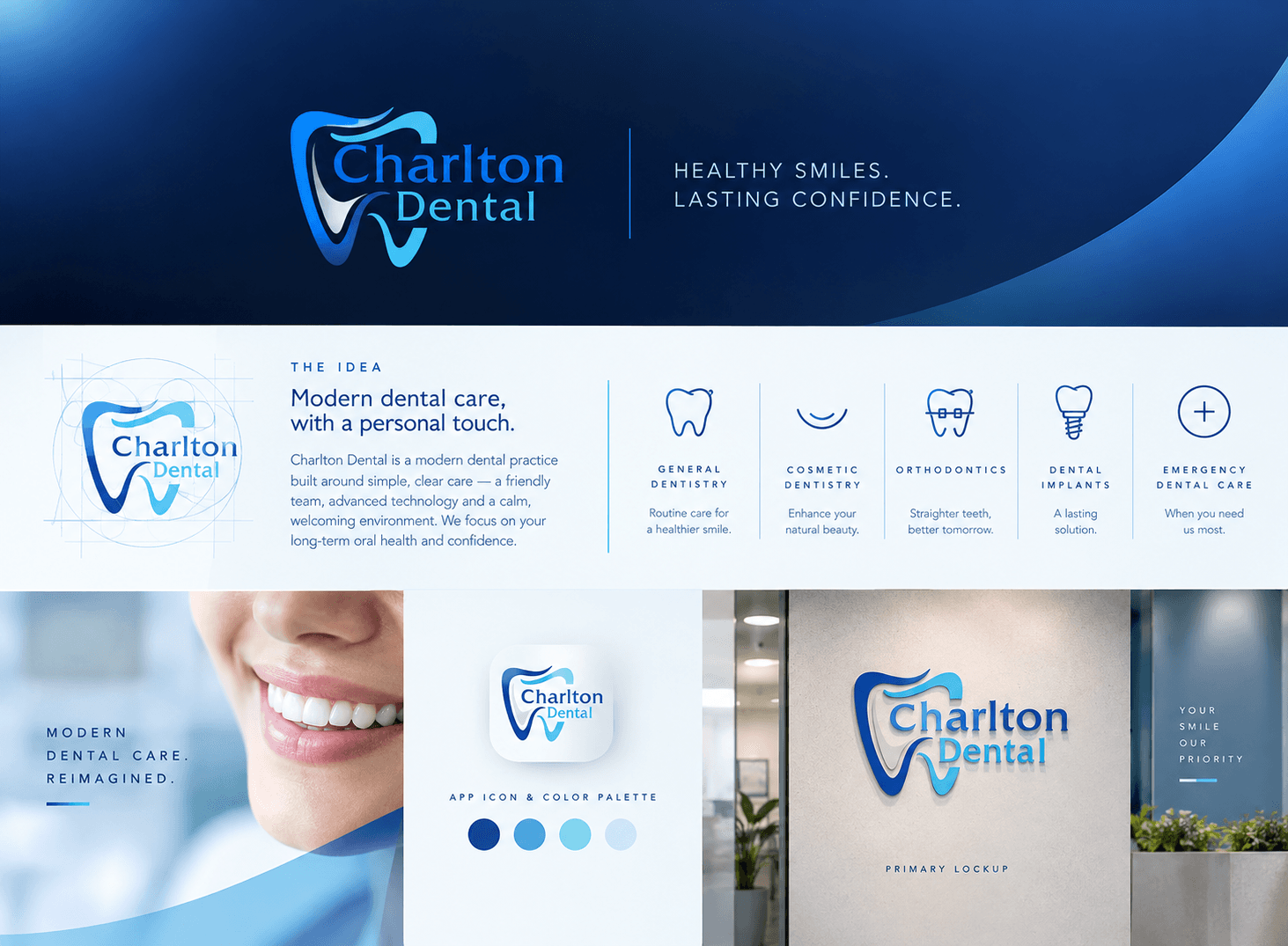
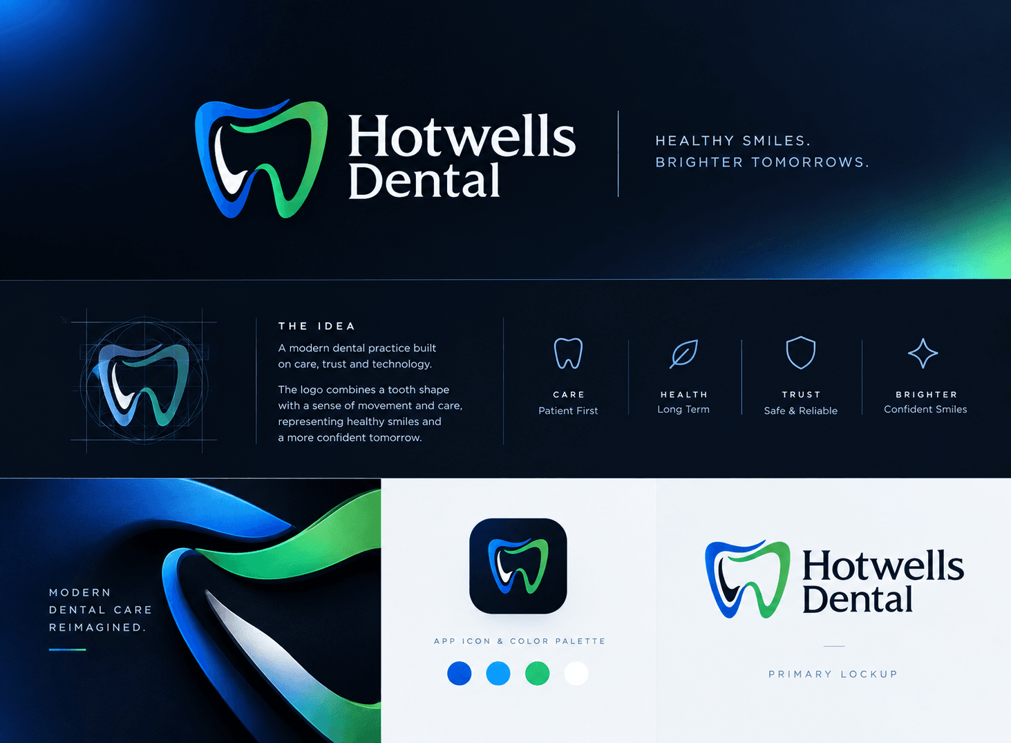
A logo is the most repeated piece of your brand — on a storefront, a favicon, an invoice and a delivery box. We design original marks and wordmarks that are simple enough to remember, sturdy enough to work at 16 pixels, and specific enough that they could only belong to you.

A short brief on your business, audience and competitors. We look at what the category already looks like so your mark stands apart instead of blending in.
Distinct directions, each built on a different idea rather than three colour variations of one sketch. Every route is shown in use, not floating on a white page.
The chosen route is redrawn and adjusted — curves, spacing, weight and proportion — until it holds up in one colour, reversed, and at very small sizes.
Primary lockup, stacked and horizontal versions, the standalone mark, and a simplified icon for app icons, favicons and social avatars.
The colours and typeface that sit with the logo, so it doesn't arrive alone. For a full visual system, see brand identity.
Clear space, minimum sizes, colour versions and common mistakes, in a short document your printer, developer or social media manager can follow.
We agree what the logo must say, where it will live and what it must not look like.
Sketching and early digital drafts across several ideas; we keep only the ones that survive a small-size test.
Concept routes shown on real applications — signage, a phone screen, stationery — with the thinking behind each.
The chosen route is drawn precisely and tested in every colour and size, with your feedback folded in.
Final files, the usage guide and a handover call so the people using your logo know how.
TODO: typical duration from Dev
TODO: ₹ from Dev
The main factors are how many concept routes you want, whether we start from existing research or need to do it, and how many variations and applications you need. A logo alone costs less than a full identity system. TODO: add a ₹ starting price once Dev confirms it.
The logo is one element. A brand identity is the whole system around it — colours, typography, imagery, layout rules and templates — so everything you publish looks related. If you need more than the mark, see our brand identity service.
Yes. Once the project is paid in full, the final artwork and its rights are transferred to you. TODO: confirm the exact wording from Dev's contract.
Often that is the better choice, especially if customers already recognise it. We can refine the drawing, fix proportions and modernise the type while keeping what people know. If the change is bigger, it becomes a rebrand.
It is designed for screens first. Every logo comes with a simplified icon for favicons, app icons and social profiles, and is tested at small pixel sizes before it is signed off.
Related services
Let's build an identity with purpose.