The challenge
Most dental brands look alike — a blue tooth and a sans-serif name. Hotwells Dental wanted to be recognisably its own while still reading as safe, modern and trustworthy.
Healthy smiles. Brighter tomorrows.
Reimagining a dental brand through a distinctive visual identity, refined typography, and a cohesive digital experience.
Most dental brands look alike — a blue tooth and a sans-serif name. Hotwells Dental wanted to be recognisably its own while still reading as safe, modern and trustworthy.
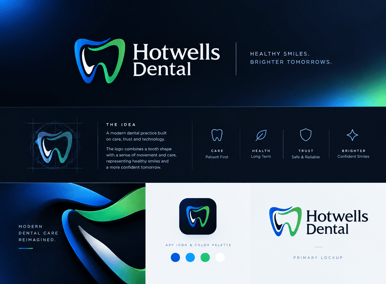
We paired the tooth mark with a ribbon of movement that runs from blue into green, bringing health and freshness into a category dominated by blue. A classic serif wordmark adds warmth and a sense of an established practice. The system is organised around four plain values — care, health, trust and brighter smiles — which carry through to the website.
A distinctive identity — mark, serif lockup, blue-to-green palette and brand values — applied across the practice’s digital presence and website.
The idea
Built on care, trust and technology.
The logo combines a tooth shape with a sense of movement and care, representing healthy smiles and a more confident tomorrow.
What the brand stands for
Patient first
Long term
Safe & reliable
Confident smiles
Colour palette
Deliverables
Tell us where you're headed and we'll show you how we'd get there.