01Software & digital agency

Zuvexa

Software for what’s next.

A complete digital brand system built around a bold identity, refined visual language, and a modern software experience designed for what’s next.

Client
Zuvexa
Sector
Software & digital agency
Services
BrandingDesignDevelopment
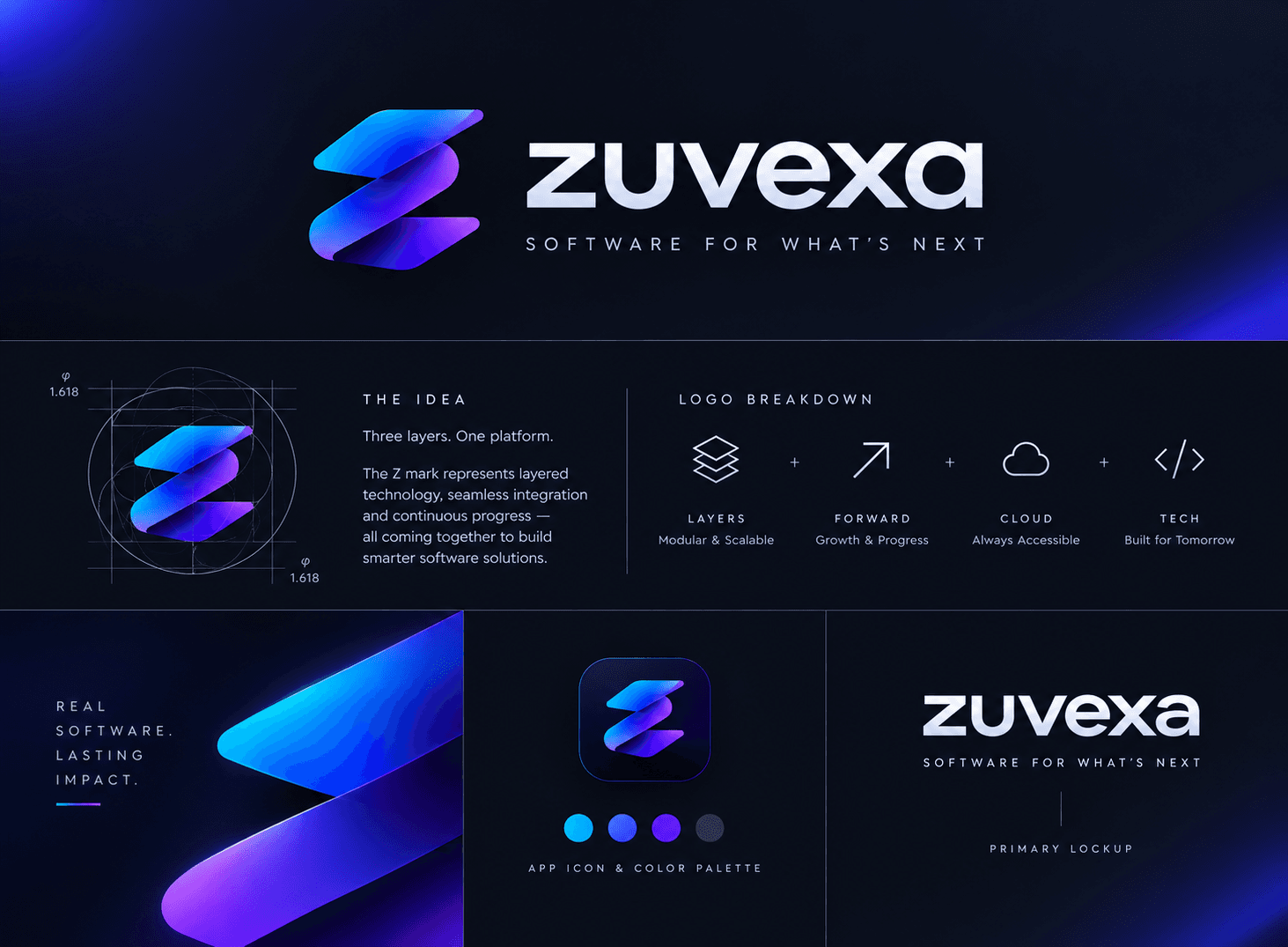
Zuvexa brand board: the layered Z mark and wordmark, its golden-ratio construction, four brand pillars, an app icon, the colour palette and the primary lockup
01

The challenge

Our own brand had to do two jobs at once: signal the craft of a design team and the reliability of an engineering one. It needed to hold up everywhere a young company shows up — an app icon, a proposal, a website — without leaning on a large visual system to carry it.

02

The approach

We built the mark from three layered, offset forms that read as a single Z. Each layer was drawn on a golden-ratio grid so the curves stay balanced at any size, and the gradient runs from electric cyan to deep violet to suggest movement through the stack. A confident lowercase wordmark and a restrained, dark-first palette keep the mark doing the talking.

03

The outcome

A compact identity system — mark, wordmark, primary lockup, app icon and palette — that now runs across this website and everything we send to clients.
The idea

Three layers. One platform.

The Z mark represents layered technology, seamless integration and continuous progress — all coming together to build smarter software solutions.

What the brand stands for

Layers

Modular & scalable

Forward

Growth & progress

Cloud

Always accessible

Tech

Built for tomorrow

Colour palette

#01B2FE
#3857FD
#5D17FD
#2C324F

Deliverables

Logo markWordmarkMark constructionPrimary lockupApp iconColour paletteWebsite

Have a project like these?

Tell us where you're headed and we'll show you how we'd get there.

Start a Project →