02Dental practice

Charlton Dental

Healthy smiles. Lasting confidence.

A refined dental brand experience focused on clarity, professionalism, modern care, and a stronger digital presence.

Client
Charlton Dental
Sector
Dental practice
Services
BrandingDevelopment
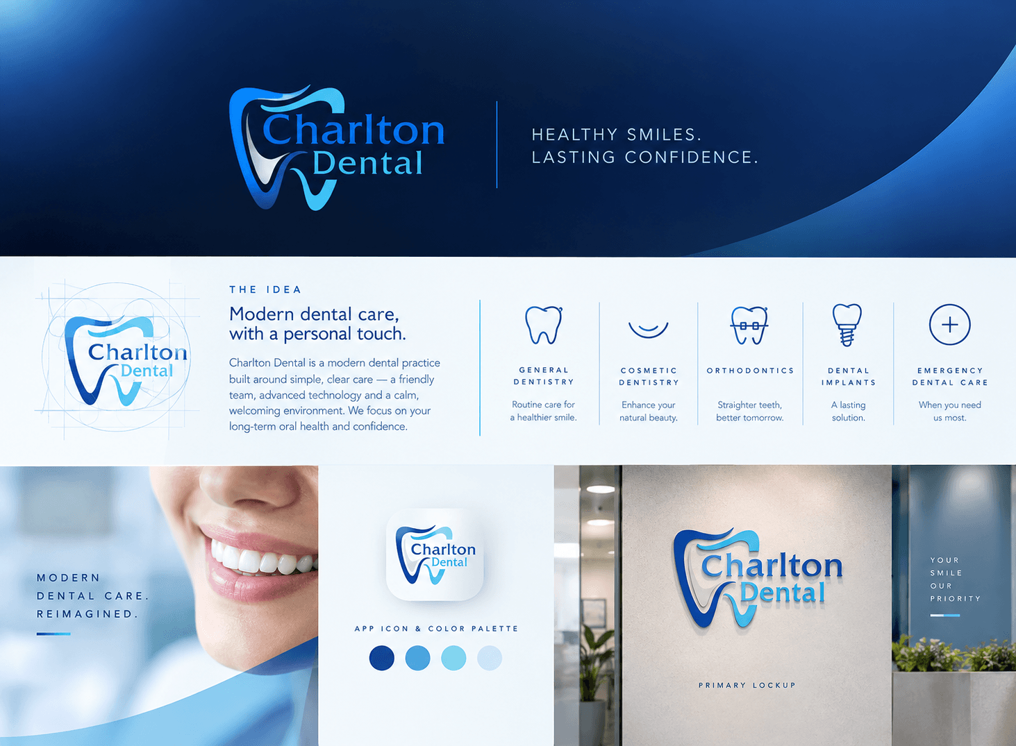
Charlton Dental brand board: a flowing tooth mark and wordmark, the brand idea, icons for five treatments, an app icon, a blue colour palette and the logo on a reception wall
01

The challenge

Charlton Dental offers everything from routine check-ups to implants and emergency care. The brand had to feel clinical enough to trust and warm enough to feel personal — and make five quite different treatments easy for a patient to tell apart.

02

The approach

We drew the tooth mark as a single flowing line, so it reads as care and movement rather than anatomy. A palette running from deep navy to pale sky blue keeps the practice calm and clean. Each treatment got its own line icon and a one-line promise in plain language, so the same system works on signage, in the app icon and across the website.

03

The outcome

One identity system covering the mark, lockup, palette and a five-part treatment icon set, carried through to the practice’s website.

The idea

Modern dental care, with a personal touch.

Charlton Dental is a modern dental practice built around simple, clear care — a friendly team, advanced technology and a calm, welcoming environment.

What the brand stands for

General dentistry

Routine care for a healthier smile

Cosmetic dentistry

Enhance your natural beauty

Orthodontics

Straighter teeth, better tomorrow

Dental implants

A lasting solution

Emergency care

When you need us most

Colour palette

#114494
#4BA5DE
#82D5EF
#CCE7F7

Deliverables

Logo markPrimary lockupColour paletteTreatment icon setApp iconSignage lockupWebsite

Have a project like these?

Tell us where you're headed and we'll show you how we'd get there.

Start a Project →